Tag Archives: art

Mom’s Artwork::Exhibit 11: Three color illustrations

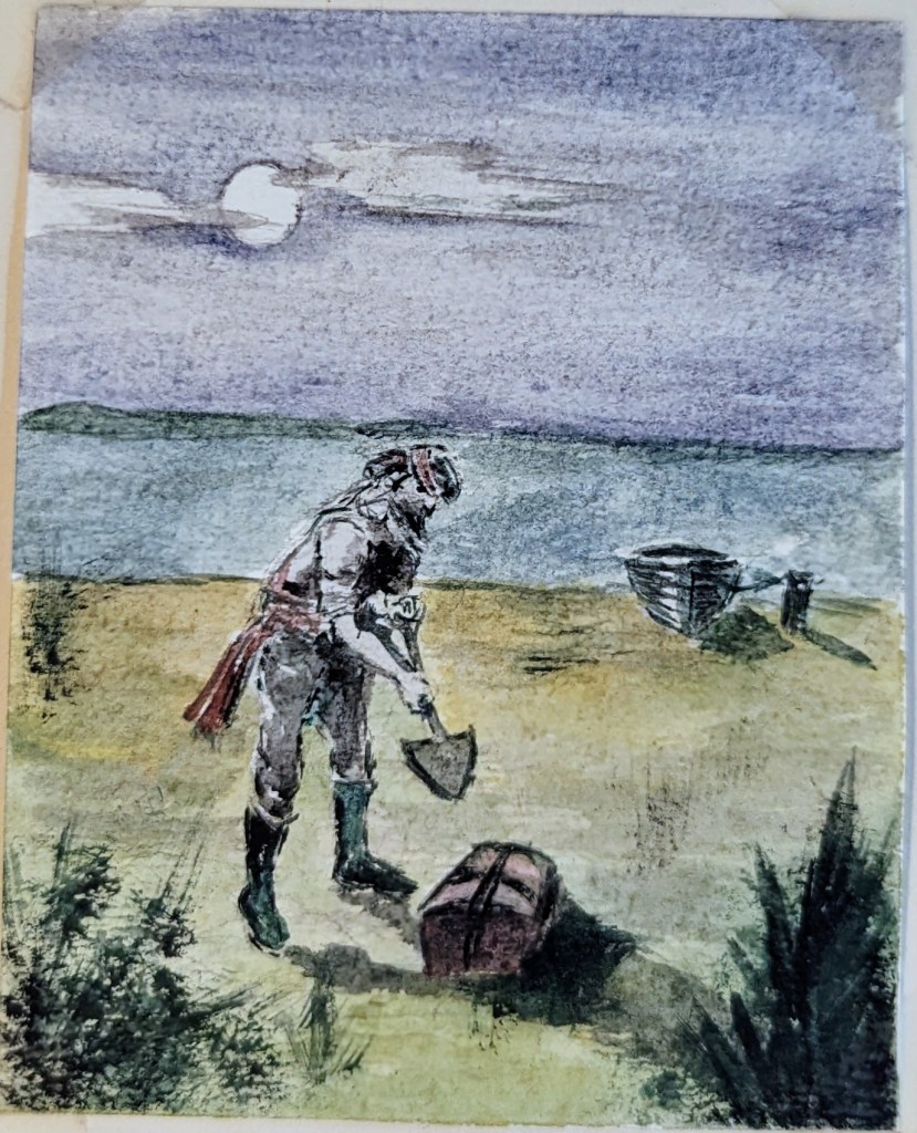
I don’t remember this assignment from The Famous Artists School. I’m sure she used magazine advertisements as the models. She did that a lot.

This first one garnered many comments and suggestions:
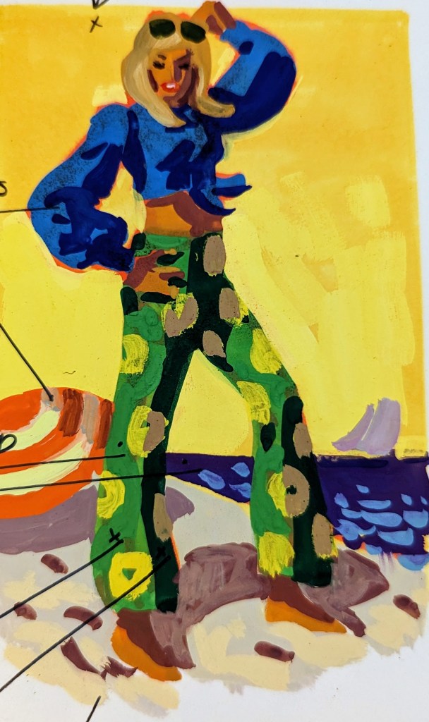
  • Experiment!
  • See how an imaginative sky color adds to the sunny effect? (arrow to sky)
  • Richer tan flesh colors
  • Blue and orange are complementary (contrasts) (arrow to shirt, outlined in orange)
  • Yellow is complemented by violet (arrow to ocean as contrasted to yellow sky)
  • Warm (arrow to green in pants)
  • Cool (arrow to sand?)
  • Warmest — most intense color in foreground

This one only had a couple of comments

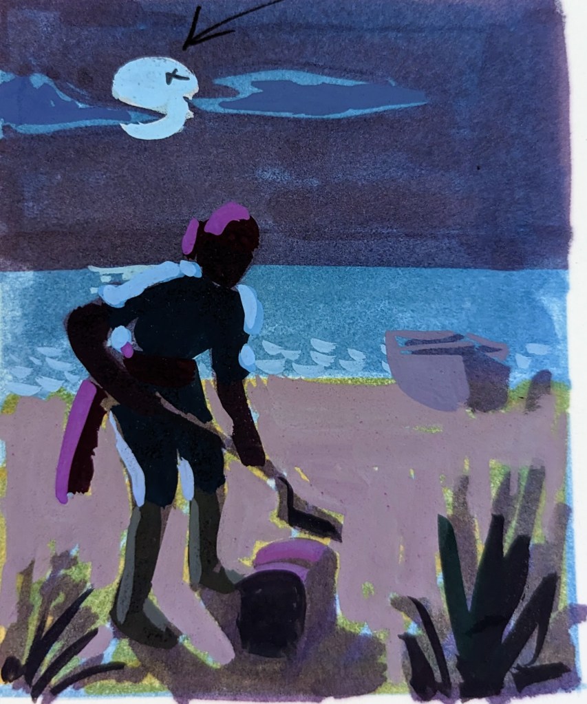
  • Deeper values — cooler bluer colors — think of moon as a cool light source (arrow to moon)
  • Keep shadows flat — little light is reflected at night

This last one was praised.
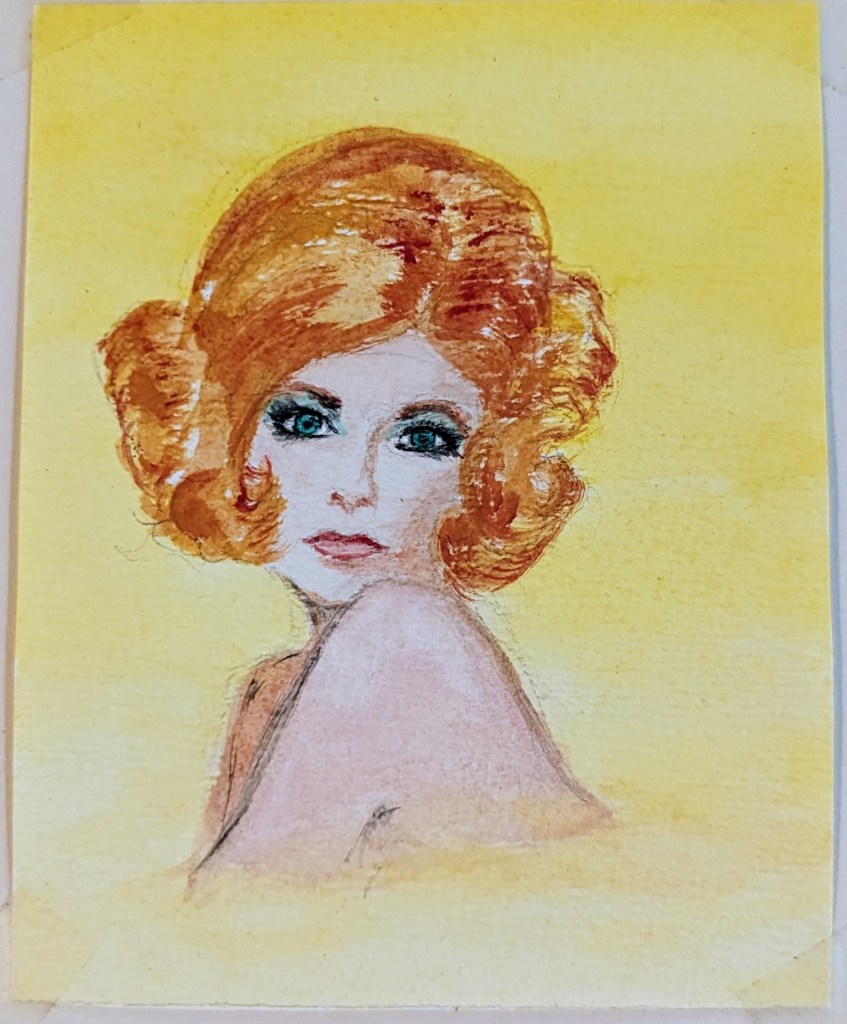
  • Values quite good!
  • White stripes help to relieve intensity of background (pointing to stripes in background)

Mom’s Artwork::Exhibit 10: Simple Simon

I’ve written about my mom’s tenure with the Famous Artists School several times. I found a few more of her assignments today.

This one I remember well. She used an illustration from one of my books as the model. I don’t know it it was cheating or not, but the evaluator had a few suggestions.

Mom’s assignment

She pretty much copied the pie man from this image.

Illustration from The Junior Instructor Book 2 (I always wondered why this illustration made Simon look like a girl)

The instructor, and in my opinion, rightly so, suggested that Simon look more adorable than scary. They provided the following feedback and redrew the scene to illustrate their opinions.

  • Make Simon smaller & lovably goofy, clearly indicating his financial predicament.
  • I like your dog, to which you can add other child pleasing small animals, fowl, turtles, birds and animated thistles
  • This is a nonsense rhyme, so have fun!
  • Emphasize the bakers white costume with value contrast
  • Unify the lively fair to avoid spottiness
  • Lower the horizon to make the baker larger
  • A vignette edge is more interesting and creates air around the figures

Art in the House

A few years ago at an arts and crafts show in Washington, DC a relatively new friend who’d never been to my house asked me if I had art in my house. It was a question I was unprepared to answer and said no, except for my daughter’s paintings and drawings, we really had no other art in the house. My friend went on to tell me about the art pieces in her house but I wasn’t listening. I was thinking of the art in my house and how I should have answered the question differently.

At the time I had:

  • Jeremy’s “Dona at Stonehenge” (as well as at least three of his other paintings)
  • Robert Addison’s “Moonlit Carousel”
  • Mary Hamilton’s “Wolves Dining Out (Observed)”, and “The Invitation”

We also had various pieces of pottery and carved wooden pieces handmade by artists.

Since my friend’s question we’ve obtained (mostly as gifts) several other pieces of art created mostly by artists we know.

Every time we do receive a new painting, print, carving or piece of pottery I think back to that question, “Do you have any art in your house?” and silently say to my friend, “As a matter of fact, I do. I have a lot of art in my house.”