I don’t remember this assignment from The Famous Artists School. I’m sure she used magazine advertisements as the models. She did that a lot.
This first one garnered many comments and suggestions:
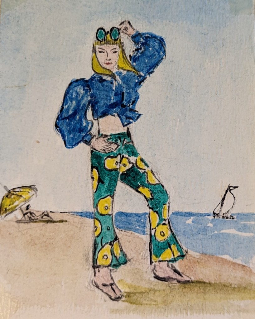
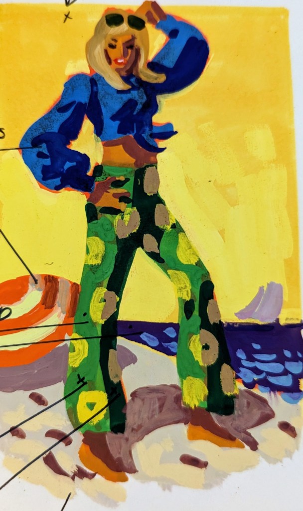
- Experiment!
- See how an imaginative sky color adds to the sunny effect? (arrow to sky)
- Richer tan flesh colors
- Blue and orange are complementary (contrasts) (arrow to shirt, outlined in orange)
- Yellow is complemented by violet (arrow to ocean as contrasted to yellow sky)
- Warm (arrow to green in pants)
- Cool (arrow to sand?)
- Warmest — most intense color in foreground
This one only had a couple of comments
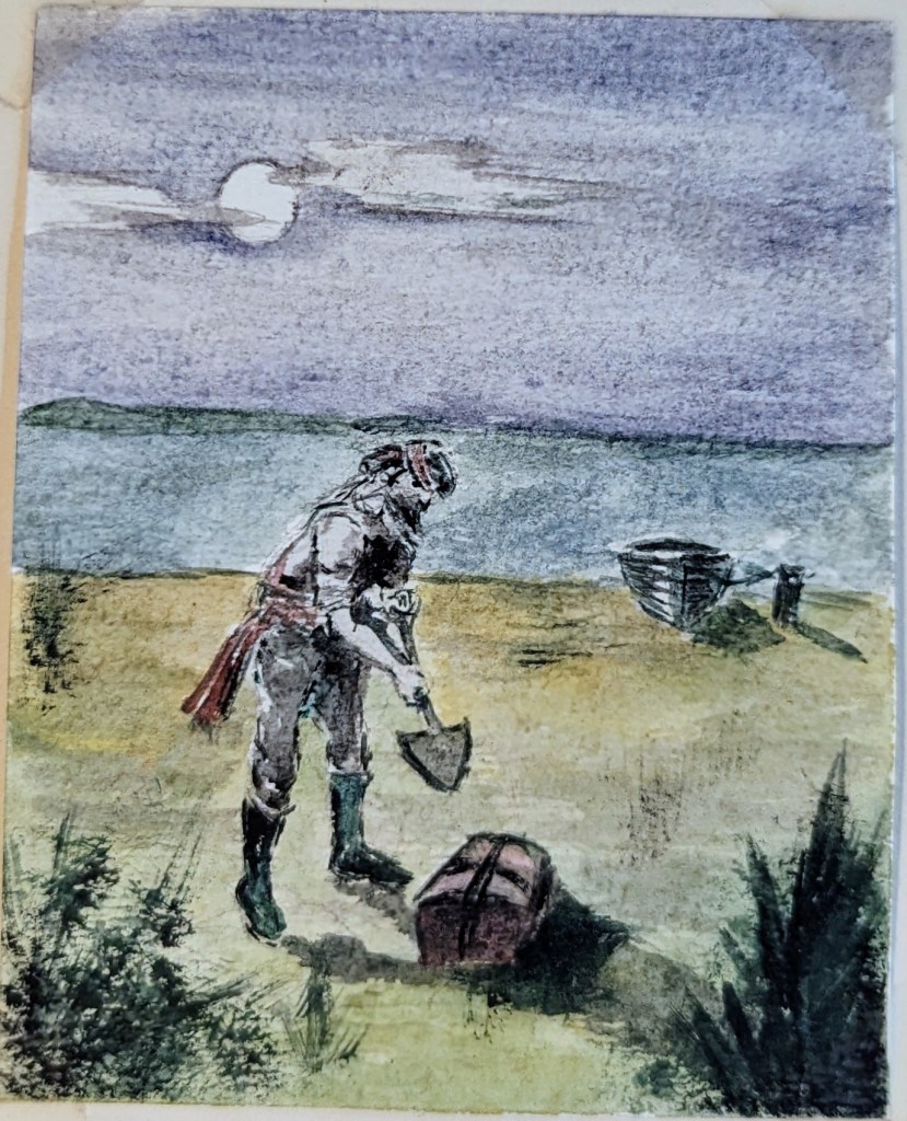
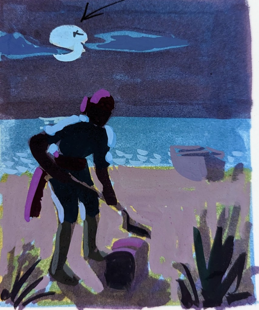
- Deeper values — cooler bluer colors — think of moon as a cool light source (arrow to moon)
- Keep shadows flat — little light is reflected at night
This last one was praised.
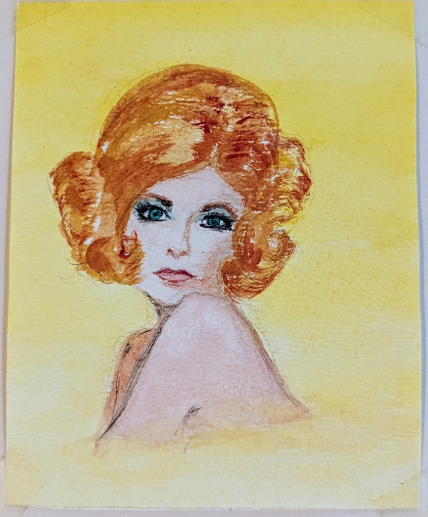

- Values quite good!
- White stripes help to relieve intensity of background (pointing to stripes in background)