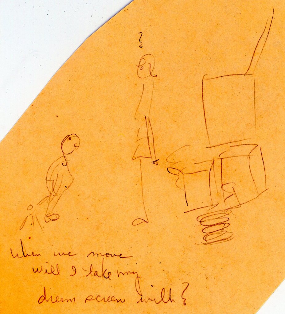
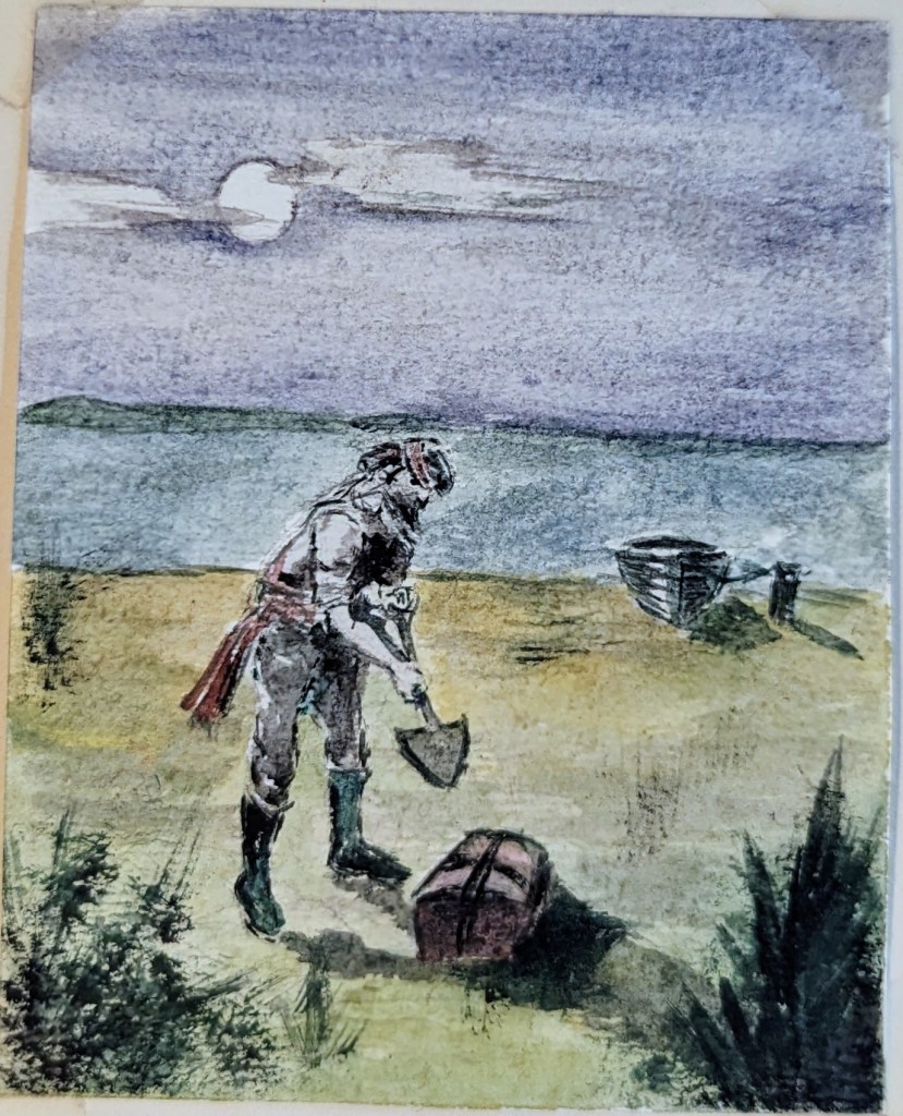
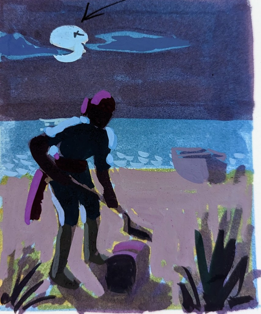
Tag Archives: famous artists school

Mom’s Artwork::Exhibit 11: Three color illustrations

I don’t remember this assignment from The Famous Artists School. I’m sure she used magazine advertisements as the models. She did that a lot.

This first one garnered many comments and suggestions:

  • Experiment!
  • See how an imaginative sky color adds to the sunny effect? (arrow to sky)
  • Richer tan flesh colors
  • Blue and orange are complementary (contrasts) (arrow to shirt, outlined in orange)
  • Yellow is complemented by violet (arrow to ocean as contrasted to yellow sky)
  • Warm (arrow to green in pants)
  • Cool (arrow to sand?)
  • Warmest — most intense color in foreground

This one only had a couple of comments

  • Deeper values — cooler bluer colors — think of moon as a cool light source (arrow to moon)
  • Keep shadows flat — little light is reflected at night

This last one was praised.

  • Values quite good!
  • White stripes help to relieve intensity of background (pointing to stripes in background)

Mom’s Artwork::Exhibit 10: Simple Simon

I’ve written about my mom’s tenure with the Famous Artists School several times. I found a few more of her assignments today.

This one I remember well. She used an illustration from one of my books as the model. I don’t know it it was cheating or not, but the evaluator had a few suggestions.

Mom’s assignment

She pretty much copied the pie man from this image.

Illustration from The Junior Instructor Book 2 (I always wondered why this illustration made Simon look like a girl)

The instructor, and in my opinion, rightly so, suggested that Simon look more adorable than scary. They provided the following feedback and redrew the scene to illustrate their opinions.

  • Make Simon smaller & lovably goofy, clearly indicating his financial predicament.
  • I like your dog, to which you can add other child pleasing small animals, fowl, turtles, birds and animated thistles
  • This is a nonsense rhyme, so have fun!
  • Emphasize the bakers white costume with value contrast
  • Unify the lively fair to avoid spottiness
  • Lower the horizon to make the baker larger
  • A vignette edge is more interesting and creates air around the figures